


By Nathan Crabbe, The Invading Sea
Today is a time to “show your stripes” by displaying the iconic warming stripes graphics that illustrate how climate change is heating up the planet.

University of Reading climate scientist Ed Hawkins first created the graphic to show trends in world temperatures since 1850. A global awareness campaign is now conducted annually on Show Your Stripes Day, which is being held June 20 this year.
The graphic will be shared on social media and appear on landmarks, sports jerseys, vehicles and other places to mark the day. Each colored stripe represents the annual average temperature for a specific year as compared to the long-term average.
Red stripes represent hotter-than-average years, while blue stripes are cooler years. A strong red shift in recent years reflects rapid increases in temperatures as heat-trapping pollution has warmed the planet.
The 11 hottest years globally since records began in 1850 have all happened since 2015. Earth experienced the warmest year in the historical record in 2024, followed by 2023 as the second-warmest year and 2025 as the third-warmest year.
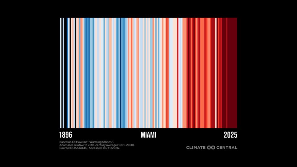
Climate Central, a nonprofit group of communicators and scientists, analyzed historical temperature data through 2025 to produce warming stripes graphics for the U.S. and individual states and cities, including 10 cities in Florida.
The graphics show more than 100 years of temperature changes relative to the long-term average for each location. Most U.S. locations show a strong warming trend.
Climate Central’s new Warming Stripes Dashboard provides custom graphics and data downloads. The group is encouraging people to share their local warming stripes on social media along with the hashtag #ShowYourStripes.
A map showing warming stripes for hundreds of other cities across the globe can be found at showyourstripes.info/map. Global temperatures broke records in 2023 and 2024 by such wide margins that it forced an earlier-than-expected expansion of the color scale used for the warming stripes.
Nathan Crabbe is editor of The Invading Sea. Banner image: Florida warming stripes through 2025 (Climate Central).
