Many people already understand that climate-warming pollution is rising globally and that it’s caused by human activities like burning fossil fuels and releasing methane gas.
But do you know if there are major climate polluters near you?
Thanks to several publicly available mapping tools, it’s never been easier to find out. As environmental protections are being rolled back at the federal level in the U.S., local knowledge may be more powerful than ever.
This article is the fourth in a series about how satellites and aircraft are changing the way we see climate-warming greenhouse gases. In this piece, you can preview some tools that display different types of pollution and learn a few ways to track down the sources of pollution to reveal who’s responsible.
Find climate pollution
Carbon Mapper
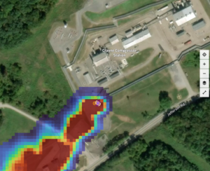
An easy and intuitive place to start is with the Carbon Mapper Data Portal. It combines data from the International Space Station, three satellites, and multiple aircraft. The mapping tool is easy to use, covers the whole globe, and contains compelling imagery of CO2 and methane plumes.
Climate TRACE
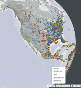
Climate TRACE offers comprehensive estimates of greenhouse gases and air pollution. In contrast to Carbon Mapper, Climate TRACE is based on estimates rather than measurements. The tool is quite detailed, and it takes a bit of a deep dive to learn its capabilities. One of the advantages of Climate TRACE is that it covers a full range of sources of climate pollution, including transportation, agriculture, buildings, land use and more. For example, you can look up the estimated emissions from major airports, showing both greenhouse gases and other airborne pollutants.
Clicking on a country, state or county will display an estimate of emissions for the entire area. From there, the “more details” tab will pull up a ranked list of all the emissions within that region. This is a quick and useful way to compare pollution from various sources, such as power plants, cities and highways.
WasteMAP
Most likely, the largest source of methane near you is a landfill. The WasteMAP tool shows thousands of landfills, even those that don’t show up in Carbon Mapper’s tool. This site uses estimates of methane emissions, and it’s especially useful for looking at waste disposal sites that have small emissions that aren’t spotted by satellites or aircraft. WasteMAP has a built-in decision support tool to compare current and future emissions scenarios based on improved practices. The site also collects local data with the help of concerned citizens. Anyone can submit photos and other information about landfills near them.
Find air pollution that harms health
The same facilities that generate climate pollution often produce other air pollutants, like fine particulate matter and unburned hydrocarbons. The tools listed below focus on health risks.
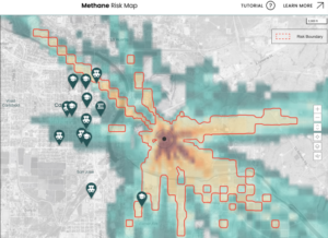
Methane Risk Map
This map combines methane plumes with population data to show where people are at risk from methane gas pollution. For each plume of methane, you can see the affected area, the number of people that live there, and the proximity of sensitive facilities like schools, child care centers, nursing homes, hospitals and prisons.
The Methane Risk Map also includes potential exposure to benzene, ethylbenzene, hexane, toluene and xylenes that can be emitted along with methane.
Climate TRACE air pollution plumes
In addition to its greenhouse gas mapping tool, Climate TRACE has a separate mapping interface for tracking air pollution. So far, the tool only includes pollution sources within major urban areas, but it does so with impressive detail. The map is animated to show how air pollution travels in the wind and disperses across larger areas.
In the coming months, the company plans to expand beyond cities to include plumes for all point-source facilities, no matter where they are.
TEMPO
TEMPO’s public data website displays a map of nitrogen dioxide every hour during daylight hours, and it covers the lower 48 states plus portions of Mexico and Canada. The data begins in 2023 and contains a few time gaps early on as the satellite was being calibrated.
This data is very detailed and is most useful when looking for specific events and places.
The Notable Dates section contains a helpful overview of different types of pollution – click on the information icon for a short description of what’s visible in each scene. The notable date of March 28, 2024, shows nitrogen dioxide coming from oil and gas production in Texas, then drifting into New Mexico.
Flaring risk and environmental justice (beta version)
Pollution disproportionately harms lower-income people, people of color and other marginalized populations. This tool examines methane flaring, which is the intentional burning of unwanted methane gas during oil and gas operations. Thousands of individual methane flares are shown on the map. Each flare is ranked by the potential harm it causes.
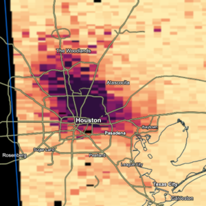
Particulate matter
This interactive map of soot and smog pollution from EarthJustice displays the average levels of fine particulate matter and ground-level ozone for every county in the U.S. during 2024.
You can find real-time air pollution data on color-coded maps from the World Air Quality Index or AirNow.gov.
Connecting the dots: Tracing the sources of pollution to those responsible
Finding pollution is an important first step, but next you’ll probably want to know what’s causing the emissions and who’s responsible.
With Climate TRACE, the sources of pollution are usually listed on each data point on the map, and that makes it easy to see which companies or activities are causing pollution.
In CarbonMapper, look at which sector the plume is coming from, such as fossil fuels, solid waste and so on. This will help you zero in on the source.
Sometimes the source is labeled, which makes the search easy. But if the specific source of pollution isn’t clear, here are some steps you can take to try to figure it out.
Sometimes the source is visually recognizable, like a power plant, landfill or a huge dairy farm
Carbon Mapper links each plume directly to its location in Google Maps, and some of the other pollution tracking tools show coordinates that you can paste into a mapping app such as Google Maps, Google Earth, or similar. These are great tools to start to figure out a potential source of pollution.
Major facilities like landfills, power plants, or refineries are often labeled on the map. Zooming out to see the surrounding area can reveal nearby details that can help trace the source or owners.
If a pollution source has no label at all, you’ll have to dig deeper. A web search of the type of infrastructure and the specific location can turn up permits, construction reports, EPA data, or news articles. For example, searching for “natural gas processing” plus a street and town name will often give some leads. You may be able to find a history of pollution, such as this EPA settlement from methane gas compressor stations in Colorado, Wyoming, North Dakota and Utah.
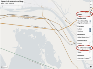
The Open Infrastructure Map is a powerful tool for pinpointing oil and gas infrastructure. In the “layers” tab, select “Oil and Natural Gas” and uncheck the other boxes. Zoom in fairly far, and pipeline names will appear.
Then do an internet search for the pipeline name, and you can likely track the ownership and sometimes a contact phone number.
For example, the pipeline company Enbridge has a directory of all its infrastructure with phone numbers for each pipeline.
Tracking down a source of pollution may take some digging, but it can be worthwhile. The abundance of information at our fingertips can empower anyone to learn about pollution in their communities. Everyone has a right to know what’s in the air they breathe, and now, it’s easier to do that.
This article first appeared on Yale Climate Connections and is republished here under a Creative Commons Attribution-NonCommercial-NoDerivatives 4.0 International License. Banner photo: Incinerator smokestacks (iStock image).
Sign up for The Invading Sea newsletter by visiting here. To support The Invading Sea, click here to make a donation. If you are interested in submitting an opinion piece to The Invading Sea, email Editor Nathan Crabbe. To learn more about greenhouse gas emissions, watch the short video below.
