By Nick Dunstone, Met Office Hadley Centre
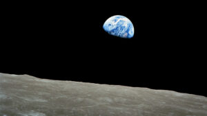
A new Earthset image has been captured by the crew of Artemis II, 58 years since the iconic Earthrise photograph taken by the crew of Apollo 8. Over these past six decades, the climate has changed dramatically.
“Oh my God, look at that picture over there! There’s the Earth comin’ up. Wow, is that pretty.” That was NASA astronaut Bill Anders’ reaction to seeing the Earth appearing to rise above the lunar horizon as their Apollo 8 spacecraft came around the Moon on Christmas Eve 1968.
Theirs were the first human eyes to see our planet at such a distance and from another celestial body. As fellow astronaut Jim Lovell said a few hours later: “The Earth from here is a grand oasis in the big vastness of space.”
That original Earthrise image is widely credited with helping to set the mainstream environmental movement in motion. Although I wasn’t born when the Apollo 8 photo was taken, a framed print of it hangs above my desk as a reminder of the beauty and fragility of our planet.
For me as a climate scientist, these photos, taken 58 years apart, inspire me to reflect on how the Earth’s climate has changed in the interim.
The concentration of carbon dioxide (and other greenhouse gases) in our atmosphere has rapidly increased as a result of over half a century of continued and spreading industrial development, driven primarily by burning fossil fuels.
This is clearly illustrated by the Keeling curve – a graph that plots the continuous record of atmospheric CO₂ from Mauna Loa Observatory in Hawaii (started by Charles Keeling in 1958).
This curve shows a steep and steady increase from approximately 320 parts per million (ppm) in 1968 to about 430ppm in 2026. This increase of over one-third in the total carbon dioxide in our atmosphere shows little sign of slowing down.
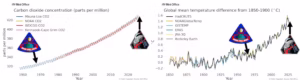
That additional blanket of greenhouse gases has increased the surface temperature of our planet. Data from the World Meteorological Organization shows how the global mean temperature record (the average temperature of the Earth’s surface) has risen by approximately 1.2 degrees C (2.16 degrees F) since the Apollo 8 Earthrise photo was taken. This represents most of the warming that has happened since the early industrial period in the mid-19th century.
While an average global temperature increase of 1.2 degrees C may not sound large, it means that regional hot extremes and new records are now much more likely. For example, my team’s recent research has shown that a 40 degrees C day (104 degrees F) in the United Kingdom (first recorded on July 19, 2022) is now over 20 times more likely than it was in the 1960s.
The global average temperature has surged in the past three years – most probably driven by a combination of internal climate variability and human-made emissions (including strong reductions in industrial aerosol particle emissions that largely act to cool the planet). In 2023, temperatures jumped from the previous record of 1.29 degrees C (set in 2016) to 1.45 degrees C above the early-industrial 1850-1900 baseline.
This record was then immediately broken in 2024 – the first year to temporarily exceed 1.5 degrees C (2.7 degrees F). Going beyond that boundary in a single year doesn’t mean we have breached the 1.5 degrees C target set by the 2015 Paris climate agreement, which is generally accepted to refer to a 20-year average. However, it does highlight how rapidly we are now approaching that level of warming.
Temperatures in both years were partly boosted by warmer conditions in the tropical Pacific due to El Niño, a climate phenomenon that affects weather patterns globally. Last year, after El Niño had subsided, was slightly cooler at 1.43 degrees C. However, current forecasts give a high probability for another El Niño developing during the second half of 2026. If this materializes, we could easily exceed 1.5 degrees C again.
A key question is whether global warming is accelerating. This is difficult to detect directly from the surface temperature record. However, a recent study found a significant acceleration after accounting for the “noise” of year-to-year variability.
The view from above
Climate science isn’t just about measuring changes in temperature.
One of the legacies of the 1960s space race was the subsequent launch of many satellite observation platforms that have transformed our ability to monitor, understand and predict changes to the global climate.
We now have continuous monitoring of many key components of Earth’s climate system, including sea surface temperature, sea level, and the extent of polar sea ice, glaciers and land surface changes. Unfortunately, many of these reveal worrying trends, such as more frequent heatwaves on land and sea, loss of Arctic sea-ice, melting glaciers and sea-level rise.
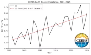
One of the most concerning recent trends comes from a set of satellite instruments called the NASA CERES, which have measured changes in the Earth’s energy imbalance (EEI) since 2000. EEI is the difference between the amount of solar energy absorbed by the planet and the thermal energy radiated back into space.
The CERES data shows a strong upward trend, indicating a growing rate of accumulation of energy, consistent with an acceleration in global heating.
Looking ahead, I hope that by the time astronauts take the first Earthrise photo from Mars (perhaps in the late 2030s), we are heading towards net-zero carbon emissions and more stable global temperatures.
Achieving net zero is this century’s Moonshot. The prize is minimizing the severity of the worst climate consequences of global heating – leaving our children and future generations a sustainable “grand oasis” here on Earth.![]()
Nick Dunstone is a climate science fellow in the Met Office Hadley Centre.
This article is republished from The Conversation under a Creative Commons license. Read the original article. Banner photo: “Earthset” is the new photo from the far side of the Moon, captured on April 6 by the crew of Artemis 2 as Earth dips behind the lunar horizon (NASA).
Sign up for The Invading Sea newsletter by visiting here. To support The Invading Sea, click here to make a donation. If you are interested in submitting an opinion piece to The Invading Sea, email Editor Nathan Crabbe.
